
Build better
products, faster.
1
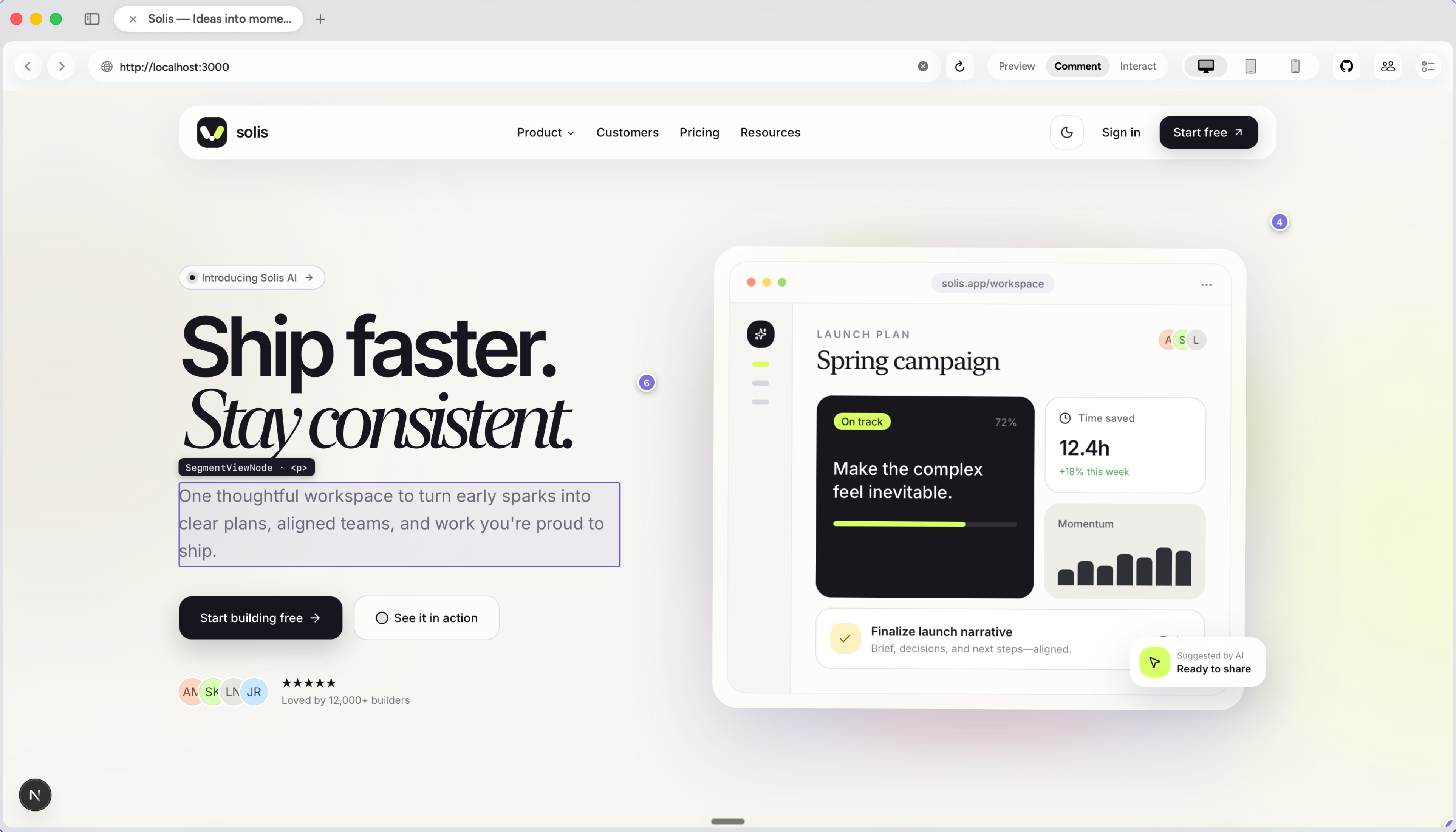
Click any element
Refyn understands exactly what you’re pointing at.
Visual feedback for AI coding agents. Click any element in your live app, leave a comment, and Refyn turns it into precise changes your agent can ship.
How it works
Point to the exact element, describe what you want, and let Refyn carry all the visual context.
See the workflowBuild better
products, faster.
Refyn understands exactly what you’re pointing at.
Add your comment
Use plain English. Be as specific or open-ended as you like.
10 changes ready
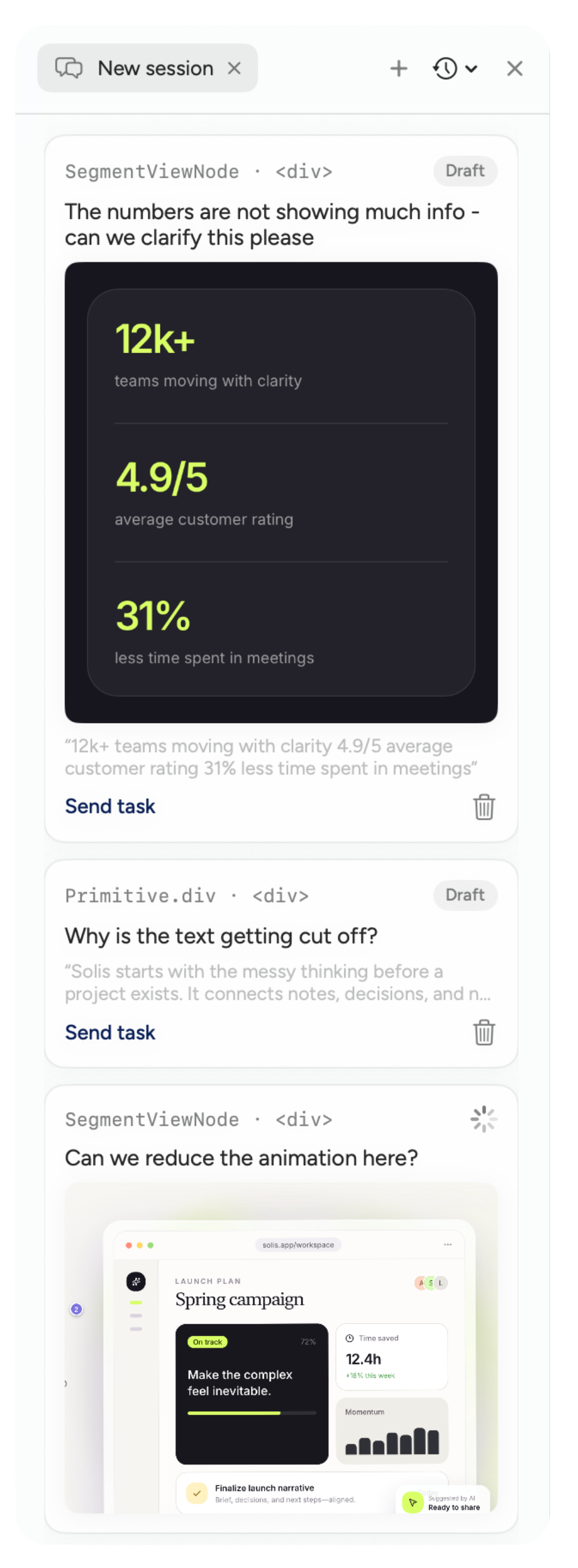
Batch as many changes as u desire into one clean revision.
Reading codebase...
Applying changes...
Tests passing
Done
It edits your code locally while you watch the result take shape.
Inside Refyn
Comment on elements, edit the live UI, and collect teammate feedback in one place.
Watch demo
From click to code. Watch how visual changes become one perfect revision.
Why we built Refyn
Without Refyn, context gets buried in screenshots and a long message. With Refyn, every request points to the exact part of the product you want changed.
Before
The agent has to guess which instruction belongs to which part of the page.
After
Review the page visually, then send clear changes to your agent in one go.

01Comment
Point to it.
Say what you see.
Click any element in your live app, leave a comment, and send its component and page context to your agent.